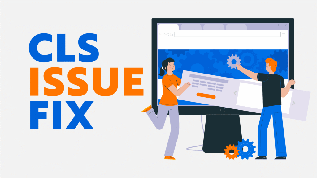
Introduction
Cumulative Layout Shift (CLS) is one of Google’s Core Web Vitals metrics that measures visual stability on a website. CLS quantifies unexpected movements of page elements during loading, such as images, ads, buttons, or text shifting unexpectedly. High CLS scores result in a poor user experience, accidental clicks, and frustration and can negatively impact SEO rankings.
In this comprehensive guide, we will explore what CLS is, why it matters, common causes of CLS, and actionable steps to fix it. This guide is written in simple English and provides practical examples, tools, and a detailed checklist to improve your website’s visual stability and overall performance.
What is Cumulative Layout Shift (CLS)?
CLS is a metric that measures how much visible content shifts on the page as it loads. Unlike load time, CLS focuses on unexpected movements that can disrupt user interactions.
For example, if a user is about to click a button and an ad suddenly loads above it, causing the button to move, this counts as a layout shift. The high CLS issue fix affects trust and usability.
CLS Performance Thresholds
- Good: 0.1 or less
- Needs Improvement: 0.1–0.25
- Poor: More than 0.25
Websites should aim for 0.1 or lower to provide a stable user experience.
Why CLS Matters for SEO and User Experience
CLS is part of Google’s Core Web Vitals and directly affects search rankings. Sites with poor CLS risk losing visitors due to unexpected shifts and lower engagement.
Benefits of CLS issue fix:
- Improved search engine rankings
- Enhanced user experience and trust
- Reduced bounce rate and accidental clicks
- Better mobile usability
- Higher conversion rates
A website with low CLS keeps users engaged and reduces frustration.
Common Causes of CLS Issues
Understanding the root causes of CLS is essential before fixing it.
1. Images Without Dimensions
Images without specified width and height attributes can push other content around when they load. This is especially common with large hero images or banners.
2. Ads and Third-Party Embeds
Ads, social widgets, or video embeds that load asynchronously can move other elements on the page.
3. Web Fonts Causing FOIT/FOUT
Flash of Invisible Text (FOIT) or Flash of Unstyled Text (FOUT) happens when custom fonts load after fallback fonts, causing text to shift.
4. Dynamic Content Injection
Pop-ups, banners, notifications, or live chat widgets inserted after the page has loaded can move content unexpectedly.
5. Animations or Transitions Affecting Layout
Animations that alter width, height, or position can contribute to layout shifts if not implemented properly.
6. Lazy Loading Without Placeholders
Images or videos that lazy-load without reserving space can push content as they load, increasing CLS.
Step-by-Step Guide to Fix CLS Issues
Step 1: Set Explicit Dimensions for Images and Media
Always define width and height for all images, videos, and media elements.
How to implement:
- Use
widthHTML attributes - Apply CSS
aspect-ratiofor responsive layouts - Reserve space for lazy-loaded images using placeholders or skeletons
Example:
<img src="hero.jpg" width="1200" height="600" alt="Hero Image">
This ensures the layout does not shift when the image loads.
Step 2: Reserve Space for Ads and Embeds
Ads and embeds often load late, causing content to move.
Solutions:
- Allocate fixed containers for ads
- Do not insert ads above existing content dynamically
- Use placeholder divs for video or iframe embeds
Example:
<div style="width:300px; height:250px;"></div>
This reserves space and prevents layout shifts when the ad loads.
Step 3: Optimize Web Fonts

Web fonts can cause layout shifts if not handled properly.
Best practices:
- Use
font-display: swapto immediately show fallback fonts - Preload critical fonts using
<link rel="preload"> - Limit the number of font families and weights
Example:
@font-face {
  font-family: 'CustomFont';
  src: url('customfont.woff2') format('woff2');
  font-display: swap;
}
This reduces text shifting when the custom font loads.
Step 4: Avoid Layout Changes from Dynamic Content
Dynamic content like popups or banners should not push existing elements.
Tips:
- Add new content below the viewport
- Use transforms for animations instead of changing the element size
- Apply CSS transitions to
opacityortransforminstead of layout-affecting properties
Step 5: Avoid Animations That Affect Layout
Animations should not cause shifts in visible content.
Implementation:
- Use
transformandopacityfor movement and fade-in effects - Avoid changing width, height, or top/left properties during animations
- Limit animation duration to avoid long shifts
Step 6: Monitor Third-Party Scripts
Third-party scripts like chat widgets or social embeds can trigger CLS.
Recommendations:
- Load scripts asynchronously with
asyncordefer - Include only essential scripts
- Reserve space for elements added by third-party scripts
Step 7: Test Mobile and Desktop Layouts
Mobile devices are more prone to CLS due to smaller screens.
Mobile optimization tips:
- Use responsive design principles
- Test multiple screen sizes and orientations
- Optimize touch targets to avoid accidental clicks
- Monitor CLS regularly with tools like Google PageSpeed Insights and Lighthouse
Tools to Measure and Monitor CLS
- Google PageSpeed Insights: Provides CLS score per page
- Google Search Console: Core Web Vitals report shows CLS trends
- Lighthouse: Measures CLS and suggests improvements
- Chrome DevTools: Performance tab tracks layout shifts
- WebPageTest: Advanced monitoring for layout shifts across devices
CLS Optimization Checklist
Quick checklist for reference:
- Set explicit width and height for all images and videos
- Reserve space for ads and embeds
- Optimize web fonts (
font-display: swapand preload) - Avoid inserting dynamic content above existing content
- Use
transformandopacityfor animations - Limit third-party scripts or load asynchronously
- Test mobile and desktop layouts
- Monitor CLS scores regularly
Common Mistakes to Avoid
- Forgetting to reserve space for images, ads, and embeds
- Lazy-loading above-the-fold images without placeholders
- Overusing animations that affect the layout
- Ignoring mobile CLS issue fix
- Focusing only on the score rather than the actual user experience
Long-Term Best Practices for CLS
- Build a stable layout from the start
- Implement responsive images and media
- Use lazy loading responsibly with placeholders
- Minimize third-party scripts
- Continuously monitor CLS after each update
- Prioritize user experience over metrics alone
Conclusion
CLS issue fix (Cumulative Layout Shift) is essential for providing a stable, user-friendly, and SEO-optimized website. High CLS frustrates users, decreases engagement, and impacts search rankings. By implementing the steps in this guide—setting dimensions, optimizing fonts, reserving space, handling dynamic content correctly, and monitoring mobile layouts—you can drastically reduce layout shifts.
Remember, CLS issue fix optimization is an ongoing process. Regular monitoring, careful design, and adherence to best practices will ensure your website delivers a smooth and reliable experience for all users.
